What Principles Distinguish a Good Dashboard From a Bad One? (With Examples)


Bad dashboards are messy. They throw everything on the screen and make users guess what is important. They make people struggle with tooltips, excessive labels and cluttered charts.
In this article, you will learn what principles distinguish a good dashboard from a bad one. As with any other good explanatory story, let us begin with the actual definitions.
What is a dashboard?
Humans are visual creatures by nature. Things make more sense for us when represented in pictures. Choosing between a spreadsheet full of numbers and a shiny bright pie chart, a vast majority of mankind will opt for a chart (or a dashboard full of charts).

In a nutshell, a dashboard is a screen on your application that displays information. Usually, dashboards provide at-a-glance views of key performance indicators so the information can be monitored at a glance. Hence the name — originated as an analogy to the control panel of a driver of a vehicle or the pilot of an aircraft. And that is a good metaphor to dive into dashboard evaluation.
Think about car dashboards. They show the information that is relevant for driving: speed, distance covered, fuel gauge, and warnings if something works improperly. A control panel showing any excessive data, like news or curious traveling facts, would be considered ridiculous. Not only it distracts a driver but also complicates access to the necessary information.
The same applies to apps. We expect a dashboard to display relevant information. Let's figure out what else makes a good dashboard.
What are the key characteristics of great dashboards?
- A good dashboard is opinionated. It uses principles of visual hierarchy to clearly indicate the most important data on a screen.
- A good dashboard reduces cognitive load. It leverages common design patterns to make a product less complex.
- A good dashboard tells stories. It clarifies cause and effect, to create a clear connection between metrics.
- A good dashboard respects users’ time. It combines, structures and organizes data in a ready-to-use format.
- A good dashboard shows performance in context. It allows users to understand whether the outcome is good or bad, expected or surprising.
- There is another important factor in dashboard success. The thing is, you need to choose the right type of dashboard.
What are the different types of dashboard designs?
Depending on the data they contain, SaaS dashboards can be divided into three types: operational, analytical, and strategic. Let us examine them one by one with relevant examples.

Operational Dashboards
Operational dashboards are the most common. You can see them in many reporting tools like Ahrefs or Semrush. Such dashboards exist to help you ensure that your business runs smoothly or, vice versa, indicate any deviation from the normal course of things.

Operational dashboards provide an update on a daily, weekly, or monthly basis in a given business area. They have a more ground-level view that distinguishes operational dashboards from strategic ones, which are next on our list.
Strategic Dashboards
Strategic dashboards are essential for C-level executives or business owners who make global decisions. That’s why they provide a bird's-eye view of KPIs and integrated data from different departments.
Below, you can see an example of a strategic dashboard by Ubiq.

Strategic dashboards help the audience to quickly draw conclusions about the success of a business vision, track performance against goals and identify problem areas. That’s why this type of dashboard shouldn’t be overloaded with details.
In case a user needs more detailed information, you can supplement a strategic dashboard with a more detailed one. With an analytic dashboard, for instance.
Analytical Dashboards
Analytical dashboards are the most complex from a design point of view. They not only display the data but also give users an opportunity to slice and dice it across different variables.
Analytical dashboards can be found at the intersection of strategic and operational dashboards. They are meant for business analysts or data analysts, who are looking for answers to specific business questions. Below, you can see an example of such a dashboard.

What are good dashboard design principles?
Understand the users and the purpose of a dashboard
It’s the users who try new products. It’s the users who evaluate if the products solve their issues well enough. It’s the users’ decision to stay or go determine the future of any SaaS product. Following user needs is the most significant principle of successful product design. Hence, it goes first on our list.
The only problem with understanding the users is that product teams often forget to look at their brainchild through customers’ optics. It's easy to see why — they are caught up in acute problems:
- The marketing department wants to add a new hype feature to your dashboard.
- The sales department wants a product to catch up to competitors.
- The tech team tries to fix bugs.
Somewhere in between all of that, users’ needs get completely lost, because, unlike sales, tech and marketing people, users are not represented at every team meeting.
How would you make customer needs impossible to forget?
Amazon CEO Jeff Bezos, for instance, leaves one empty chair at every company’s meeting. He believes that obsessing over customer experience is the only long-term competitive advantage. So he makes his colleagues report to an imaginary customer on an extra seat.
If you want a less extravagant trick to figure out what information users want to see on your dashboard, try some popular UX frameworks like user personas, jobs to be done, or user journey maps.
Choose relevant metrics
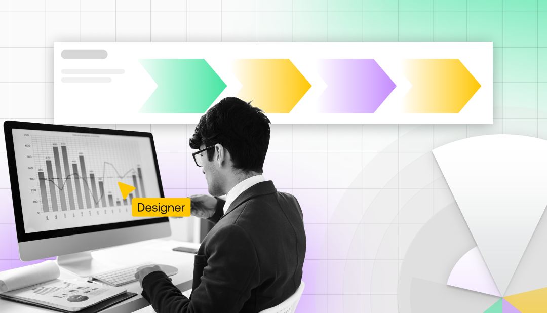
There are plenty of key performance indicators (KPIs) that any business would want to monitor. But a designer's job is to show the information in the most efficient way possible and make it easy for users to filter what they need with the intuitive tools. Overloaded screens are the easiest way to decrease a dashboard's effectiveness, so identifying the right information to include is key.
Good dashboards tend not to include more than 5 or 6 cards on the first screen. They also try to avoid scrolling when possible. The most important information in a dashboard should be placed on a single screen. If your users have to scroll all the time to find relevant data, they will eventually get tired and churn an app.

Understanding the users is the number one step to choosing relevant metrics — the ones of the most benefit. Think of the purpose of the dashboard, the people who are going to use it and what business problem they are going to solve.
Choose right visualization
Any data is just a story told in numbers. To start with choosing the right chart type for your particular case, ask yourself, what is the story your data is trying to deliver? Does it show a trend over some time period? Or does it compare different opinions? Maybe your data intends to observe the relationship between two processes.
As soon as you know what story your chart will tell, we are ready to move forward and explore the six most popular types of charts and their application scopes.
Histogram
A histogram is a graphical display of data using bars of different heights. It is an optimal choice if you need to compare data in the same category, to see the shape of the data’s distribution.

Pie chart
A pie chart is considered to be one of the least effective options because it’s complicated for users to figure out how big each part of the chart is. A pie chart still works if you need to compare categories in a smaller data set but beware that too many pieces of data will make a chart hard to read.

Line chart
You can use line charts to show data patterns. They are convenient for visualizing time series and data changes at a glance. If you only have a few values to represent, use a bar chart instead of a line chart.

Cartogram
A cartogram can be a perfect solution when you need to visualize a population through an area or map out distances while visualizing proximities.
Please note that a cartogram can distort real boundaries and thus make the map harder to read. Be careful not to confuse your audience.

Heat map
Heat maps use color in the way a histogram uses height. It is a bit like looking at a data table from above. This type of chart makes it easy to grasp and analyze complex information through color coding. So to make your chart readable, take seriously the choice of colors.

Scatter plot
When you need to show if the data expresses a trend, you may use a scatterplot. This is a chart that is often used by scientists — it helps to visualize a hypothesis of the relationship between the data points.

Have a clean dashboard - less is more
We live in a world of too much data, which compromises performance. Users spend some of their brain power to decode the visual representation, and if they are urged to spend too much, they have no recourse to understand the message beyond those visuals.
That’s why the easier a dashboard works the better. An effective dashboard simplifies the visual representation of complex data and helps to grasp it in one glance.
Therefore, a dashboard interface should be clean and minimalistic in order to minimize users’ cognitive load. Use a bare minimum of information, simple line charts or pie charts at your initial screen at least, and you won’t run the risk of confusing your customers. For advanced users, make it possible to drill down into more complex and detailed information.

Developing your informational architecture, take visual hierarchy seriously. Show the most important and urgent information first, use colors and sizes to highlight the main action on a page. Dashboards are one of the most overloaded screens in apps, so they risk turning into a confusing mess unless you manage viewers’ attention properly.
Grouping related data is always a good idea. Just like supermarkets put complementary goods together on shelves for users’ convenience, you can put related charts on one card.
Be consistent in your design
Consistency in UI/UX means making sure that all elements of an app's interface are uniform —they look or act the same way. This helps to prove a user's assumptions about the interface right, and that creates a sense of clarity and intuitiveness. The user simply does their job, without paying attention to the screens’ design, because everything works as expected.
Consistent design is especially important for dashboards. It allows users to decrease cognitive load while working with one of the most cognitively demanding app screens. Any user would be grateful if you allow them to direct their effort to reading graphs rather than figuring out how to filter data in the right way.
Users would also be grateful if they could view a dashboard properly from any of their devices, which is not so easy to implement when we are speaking about visually represented information.
Design for multiple devices
Many people need real-life data for instant decisions, so business apps have a reason to move to smartphones. But in terms of design, it can be challenging to migrate dashboards from desktop to mobile.
Due to the limited space and the large data that could be included, it becomes even more important for mobile interfaces to strictly select only what matters:
- Dashboard actions should be kept to a minimum.
- Don’t add titles and text descriptions unless they are essential.
- Do not try to create a mobile dashboard by simply copying its desktop version. A dashboard displayed on a phone should be significantly simplified.

Keep improving your dashboard constantly
Your product design is like a garden that needs constant care and attention — grass trimming, nurturing and pruning. At that very moment when you decide that you are done with user experience, your dashboard will start getting overrun with weeds.
Without designers’ care, new charts will stack on top of each other, adding complexity to the design and decreasing the quality of the user experience. In a couple of years, a dashboard will turn into a pile of data that requires urgent redesign.
To build great products, designers constantly revise what has been already done. They build, measure and learn to create a better user experience and then measure again to find what can be improved.
Such circular motion is reflected in the simplest design process model you can see in the picture below. The model consists of three design steps locked into a circle. First, you understand the users’ problem, create a solution and evaluate the result. With a new informational input from usability testing or user feedback, for instance, you go back to understanding the current situation and attempting to create an even better solution.
Wrapping up the principles of an effective dashboard
Let’s summarize the core tenets of a good dashboard design:
- Understand your users and remember their needs;
- Display only key metrics. Do not overwhelm the viewers with excessive details;
- Choose the right visualization that fits your metrics;
- Have a clean dashboard. If it takes the user more than five seconds to find the needed information, it means that the visual layout requires some improvements.
- Be consistent. Make sure all elements act in the same way.
- Never stop working on your design. Evaluate what you've created and look for ways to improve your dashboard.