Productivity Reimagined: Veosphere's journey to eye-catching branding and stellar UI/UX
Mission
Veosphere, a productivity and collaboration platform, engaged us to create a full brand identity and product design. Our mission was to deliver an impactful visual branding strategy mirroring their commitment to enhanced productivity, collaboration, and project management.
Outcome
To ensure a seamless user experience, we devised a robust UX strategy and developed an intuitive UI design, bridging the gap between technological complexity and user-friendly functionality. The result was an intuitive and visually appealing platform which combined project and resource management. Its minimalist design enabled easy scheduling and planning, enhancing productivity and collaboration.
Impact
Veosphere’s intuitive design increased user engagement and satisfaction. The platform streamlined processes and optimized resource allocation, balancing functionality and user-friendliness. It redefined productivity, project management, and collaboration through innovative solutions and exceptional design.
Highlights
- Veosphere is a comprehensive productivity, project management, and collaboration platform.
- Covers a wide range of industries, from tech startups to multinational corporations.
- Supports various collaborative features, including project tracking, file sharing, and team communication.
- Mission is to redefine the productivity market by offering a compelling and efficient platform.
Objectives
- Develop a striking visual identity which mirrors their innovative solutions.
- Deliver a full product design that aligns with their strategic goals.
- Implement an intuitive UI to enhance user engagement and satisfaction.
- Establish a robust UX strategy to ensure a seamless user journey.
- Drive the front-end development, ensuring quick, responsive interactions.


For the last 14 months, the remote Tenscope team has operated as a true extension of ours. A great digital agency if you are looking for a serious partner for design, development and optimization.
Internal capacity and resource planning are often a challenge for a significant number of companies, especially creative agencies and design studios. Designing a clean, comprehensive, and easy-to-learn platform is the goal of most of the project management platforms available today.

Yet, most of the systems focus on merging multiple features into a single app. In that process, one or more of those features seem not to get enough attention and end up underdeveloped.
Veosphere is a comprehensive productivity and collaboration platform designed to address the challenges of internal capacity and resource planning for various industries, ranging from tech startups to multinational corporations. The main objective is to provide a solution which enhances productivity, project management, and collaboration by offering an intuitive and user-friendly platform.
Veosphere embarked on a project to tackle companies’ resource and capacity planning challenges. The existing project management platforms were not meeting the needs of organizations due to their complex functionality and lack of user-friendliness. Veosphere recognized this gap and focused on developing a key feature that could enhance organizational productivity and collaboration.
Design Process
The success of the Veosphere app was driven by a systematic and collaborative approach, with each phase designed to maximize the impact of our efforts and deliver a compelling user experience. The project journey encompassed several key stages, each contributing to the transformation of Veosphere into a powerful productivity and collaboration platform.
Research phase
To lay the foundation for the redesign, we initiated a comprehensive research phase that focused on gaining a deep understanding of user needs and defining the app's future direction. This phase consisted of a series of three discovery workshops, each serving a specific purpose:
Session 01: Context Mapping and Empathy Mapping
In the first session, we conducted context mapping exercises to visualize the app's ecosystem and understand its relationship with users, stakeholders, and external factors. We delved into empathy mapping to gain insights into users' emotions, pain points, and aspirations. This immersive exploration allowed us to empathize with users' perspectives and set the stage for informed decision-making.
Context Mapping
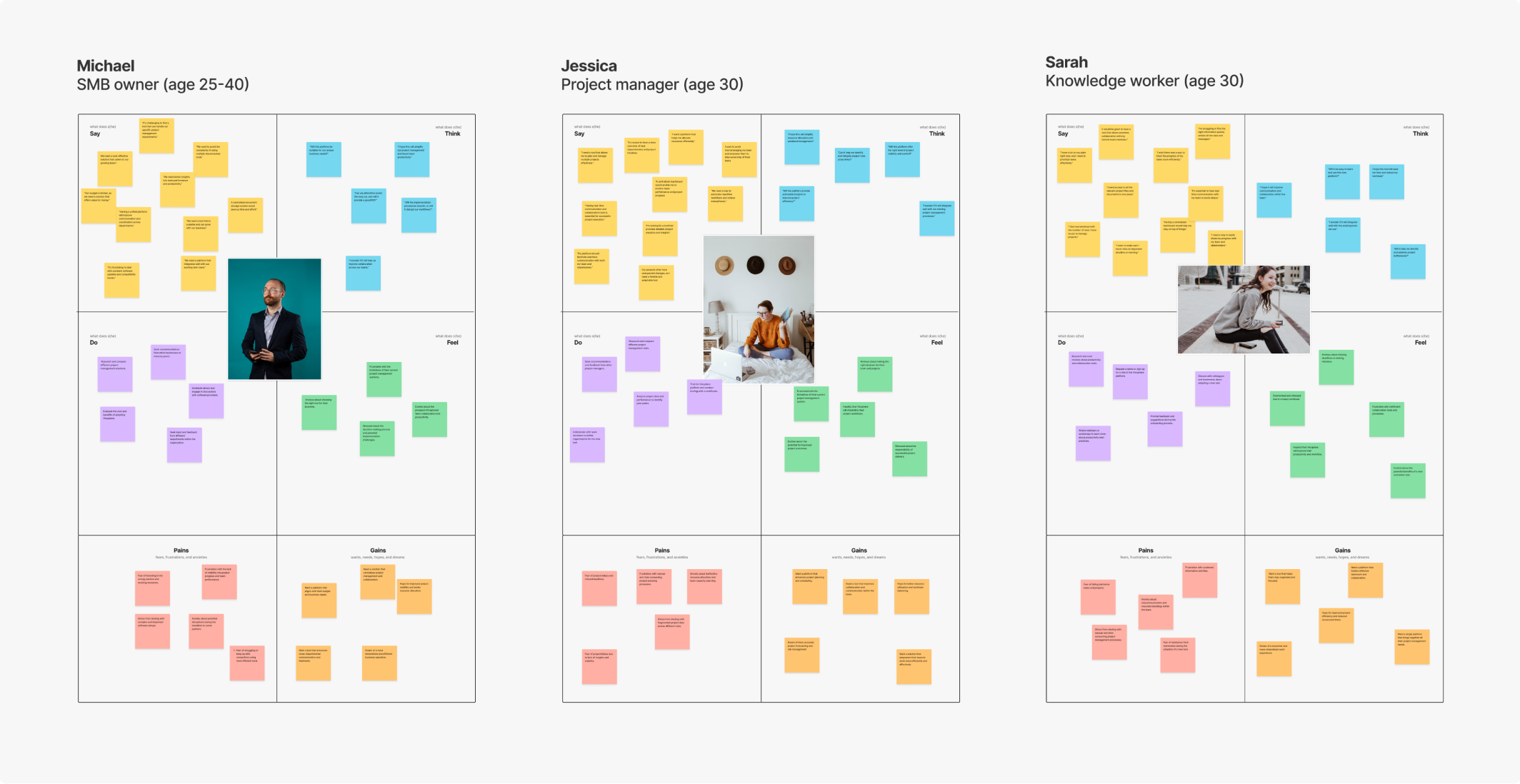
Empathy Mapping
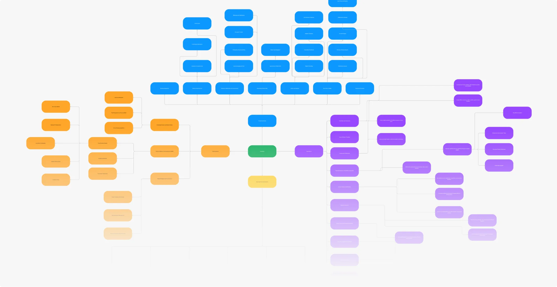
Session 02: Defining Feature List, Feature Hierarchy, and Impact Matrix
In the second session, we collaborated to define a comprehensive feature list based on user needs and business goals. We established a feature hierarchy to prioritize functionalities and determine their significance. Using an impact matrix, we assessed the potential impact of each feature on user experience and business outcomes. This session crystallized the direction of the redesign by aligning our efforts with strategic priorities.
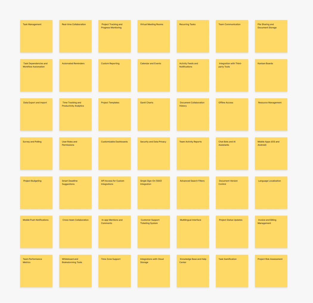
Feature List
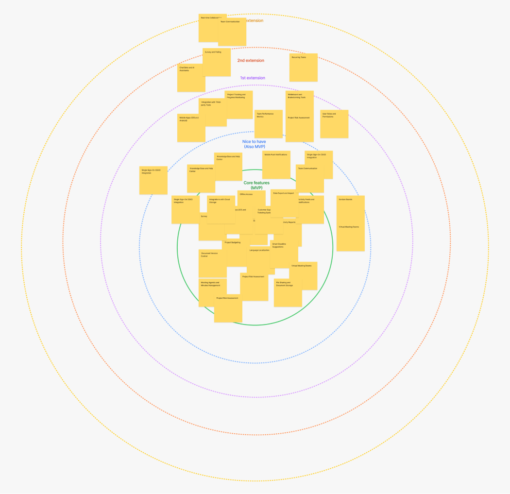
Feature Hierarchy
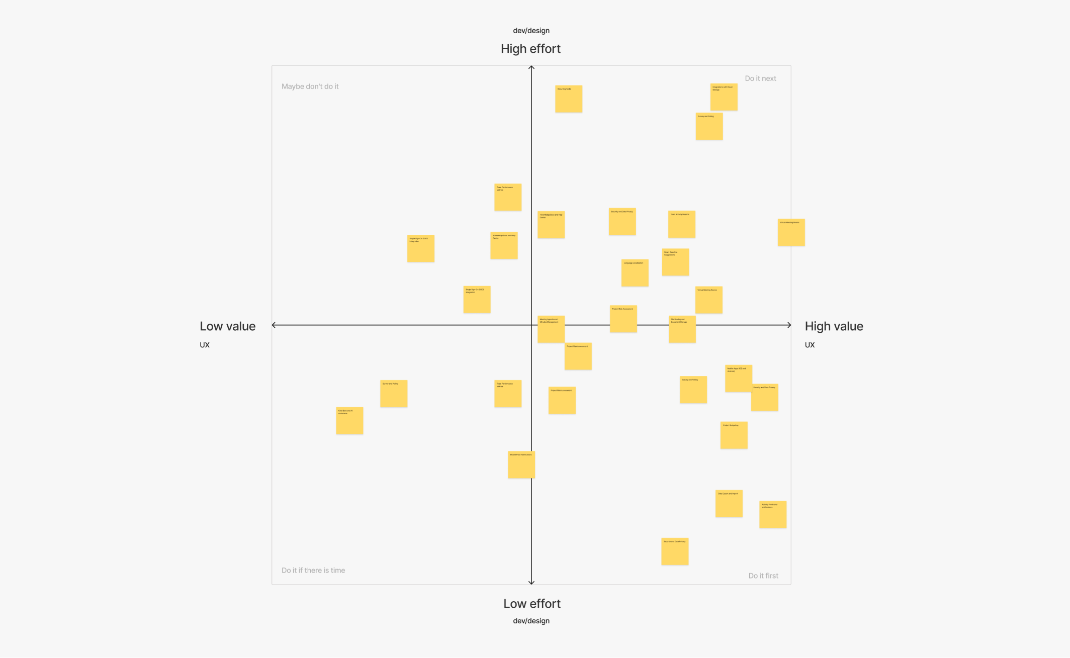
Feature Matrix
Session 03: Defining Project Roadmap
The third session focused on shaping a clear project roadmap. We plotted the journey from the current state to the envisioned future, outlining key milestones, deliverables, and timelines. This roadmap provided a structured plan to guide the execution phase and ensured that the redesign process remained focused, efficient, and goal-oriented.
Project Roadmap
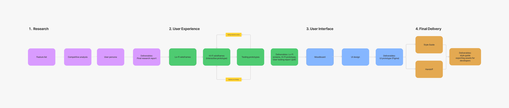
Design phase
The third session focused on shaping a clear project roadmap. We plotted the journey from the current state to the envisioned future, outlining key milestones, deliverables, and timelines. This roadmap provided a structured plan to guide the execution phase and ensured that the redesign process remained focused, efficient, and goal-oriented.
Sketching Lo-Fi and Hi-Fi Wireframes
Armed with insights from the research phase, we began sketching low-fidelity (lo-fi) wireframes that captured the basic layout and interactions of the app. These preliminary sketches facilitated rapid ideation and allowed us to iterate on design concepts. Once the lo-fi wireframes were refined and validated, we created high-fidelity (hi-fi) wireframes. These detailed designs captured the app’s visual elements, user interface components, and interactivity.
Iterative Design and Prototyping
We followed an iterative approach throughout the design process, continuously refining and enhancing the hi-fi wireframes based on user feedback and usability testing. This iterative cycle allowed us to fine-tune the user experience and ensure that the app's design aligned seamlessly with user needs and expectations. Interactive prototypes were developed to give stakeholders a tangible feel of the app's functionality and flow.
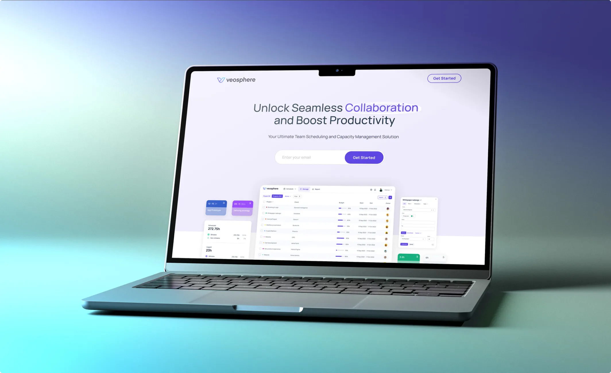
The Platform
Most of the available platforms that did similar things were either too complex and not user-friendly or looked a bit outdated. So, our client outlined a clear vision for Veosphere - a platform which masterfully blends functionality with visually attractive, minimalist design.
Manage people and projects
How we changed the structure of the configuration menu
We were working on pages of the configuration menu when we noticed some oddities in the menu itself.
For our Add a new lead page, restructuring helped to formulate the following hypotheses:
- It turned out that some closely-related pages, like Transfer settings and Transfer groups, lived on opposite sides of the menu and never met.
- It also appeared that some names of menu items didn’t match the names of corresponding pages.
- The number of the menu items could be easily halved if we merged some of them together. For instance, the Company info page sits perfectly fine inside the Company settings page.
The result was in line with the initial objective, which was the goal throughout the entire process. How did we make several planning processes appear comprehensive, easy to use, and eye-pleasing?
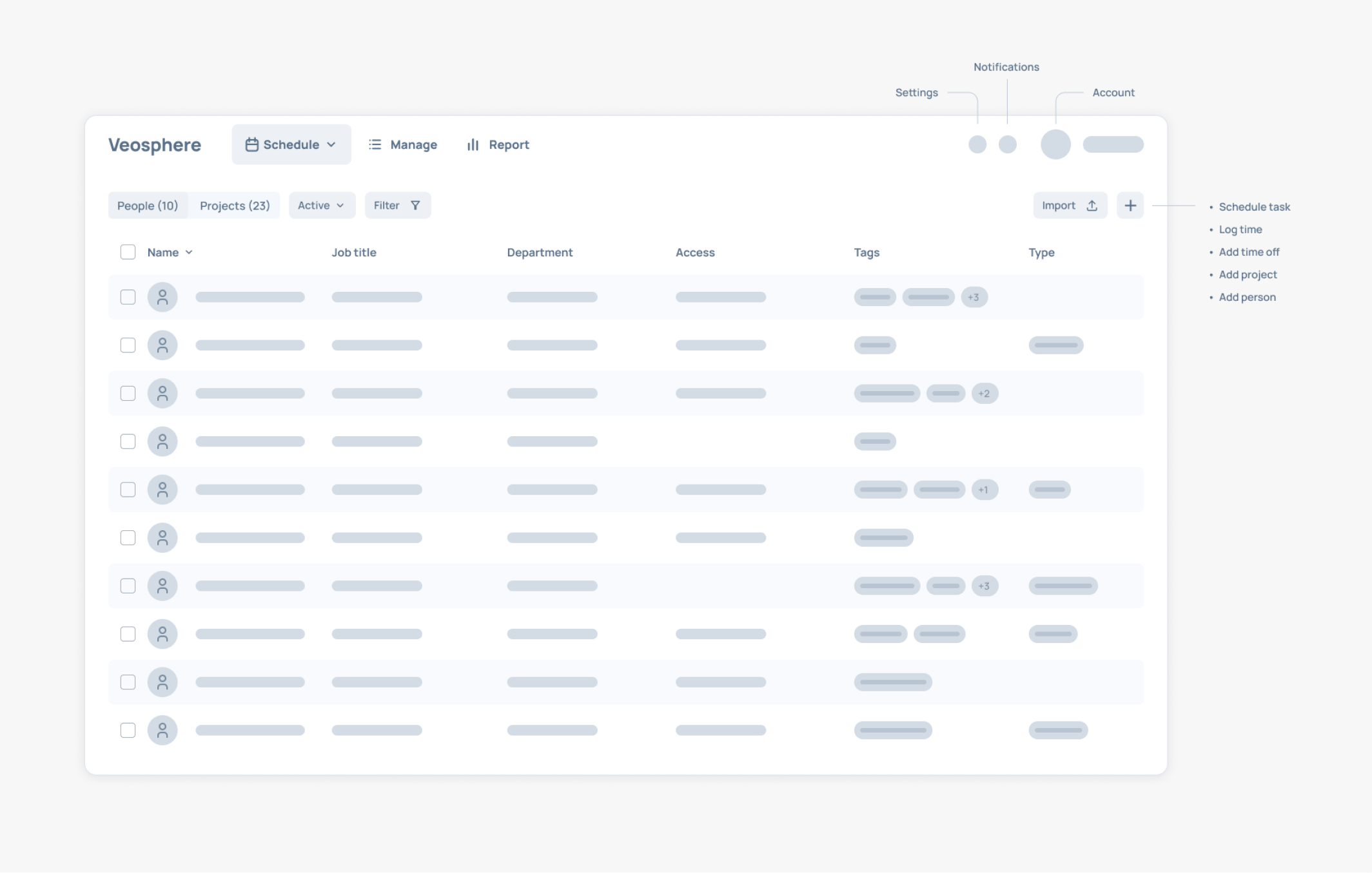
We divided the main Veosphere panel into three specific actions:
- Schedule
- Manage
- and Report
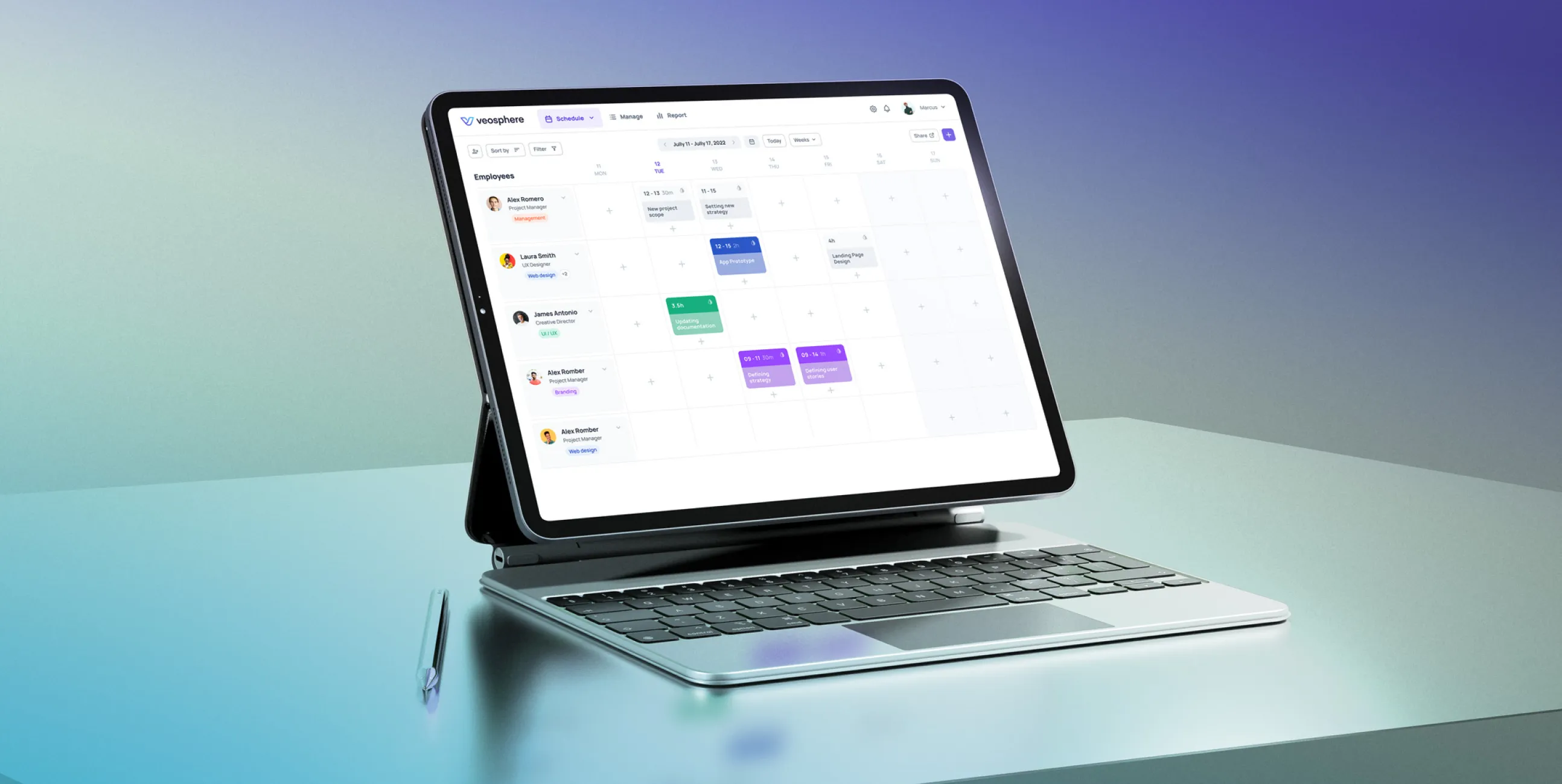
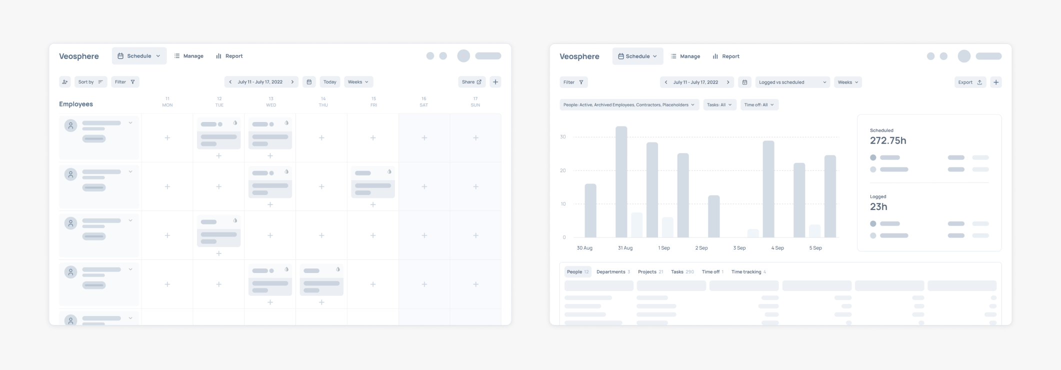
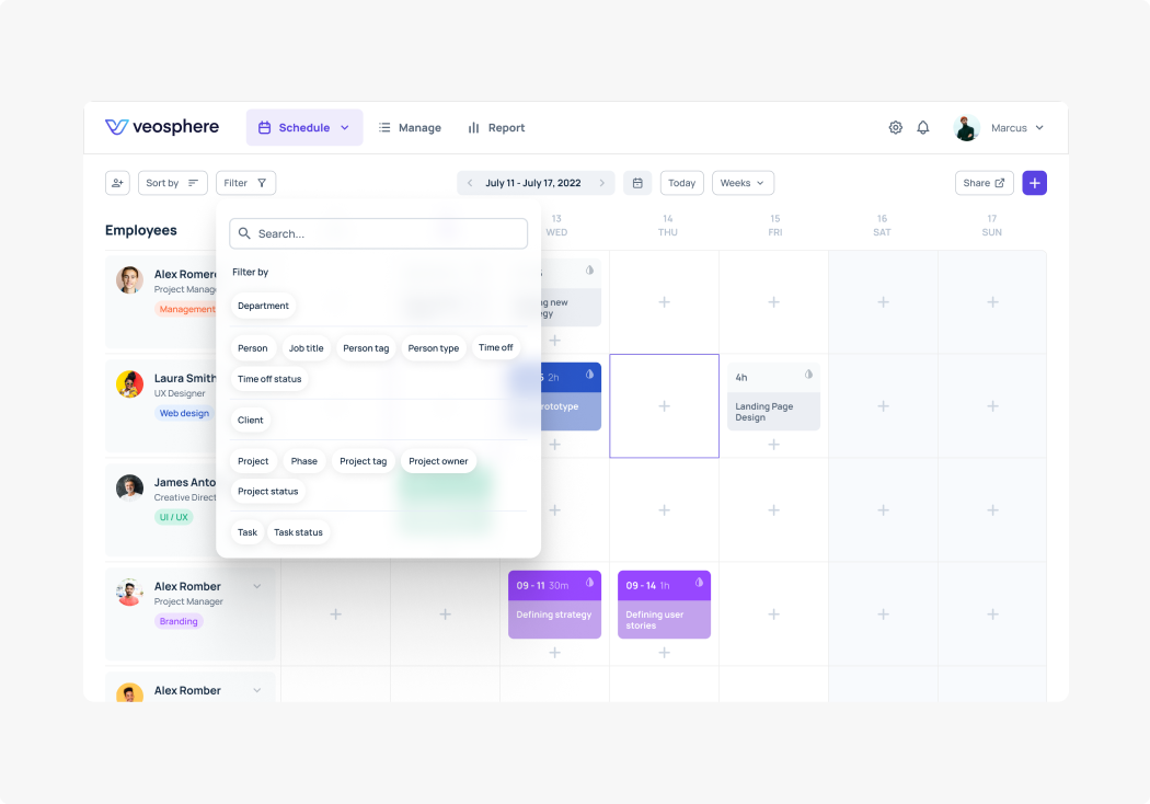
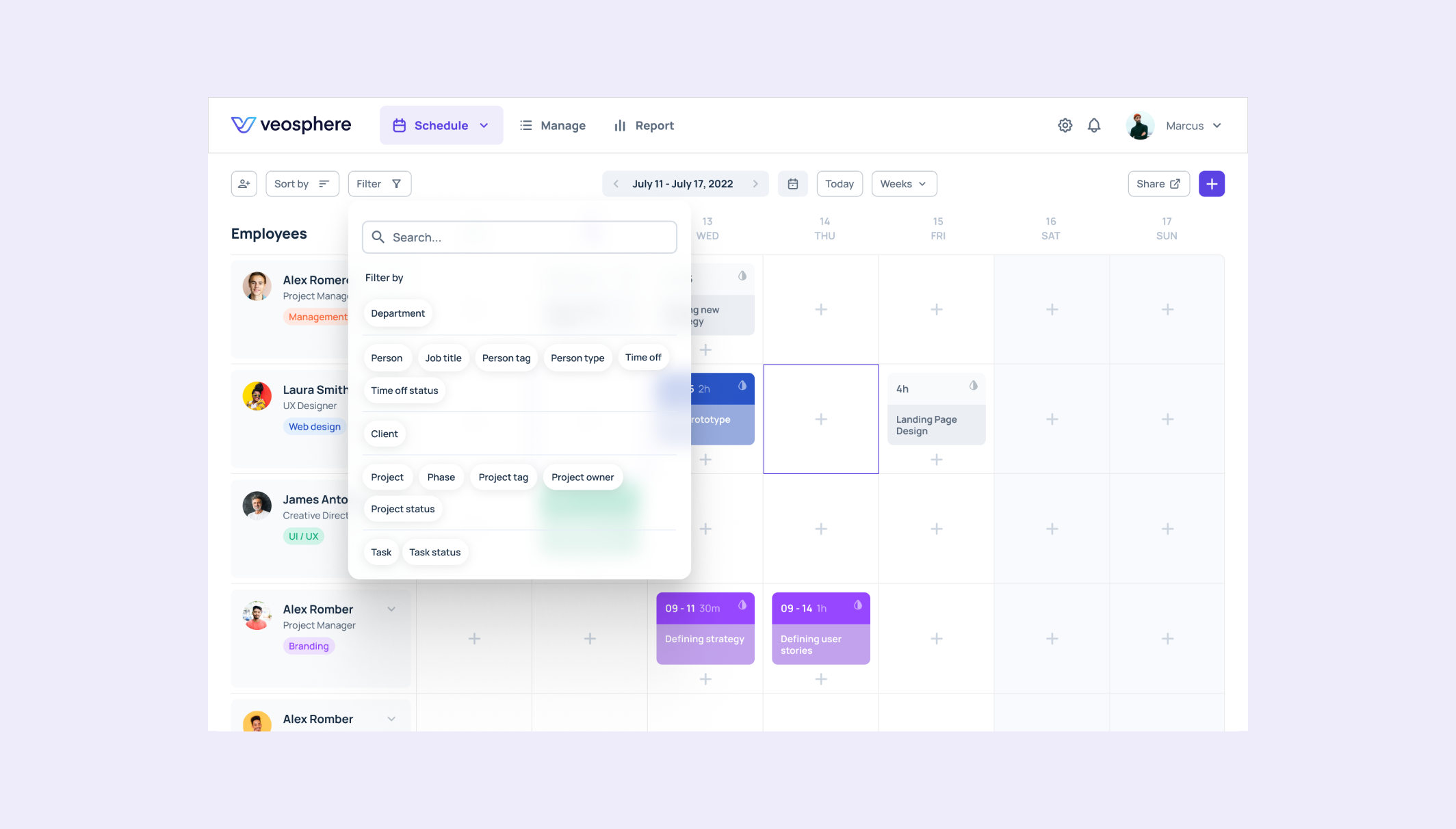
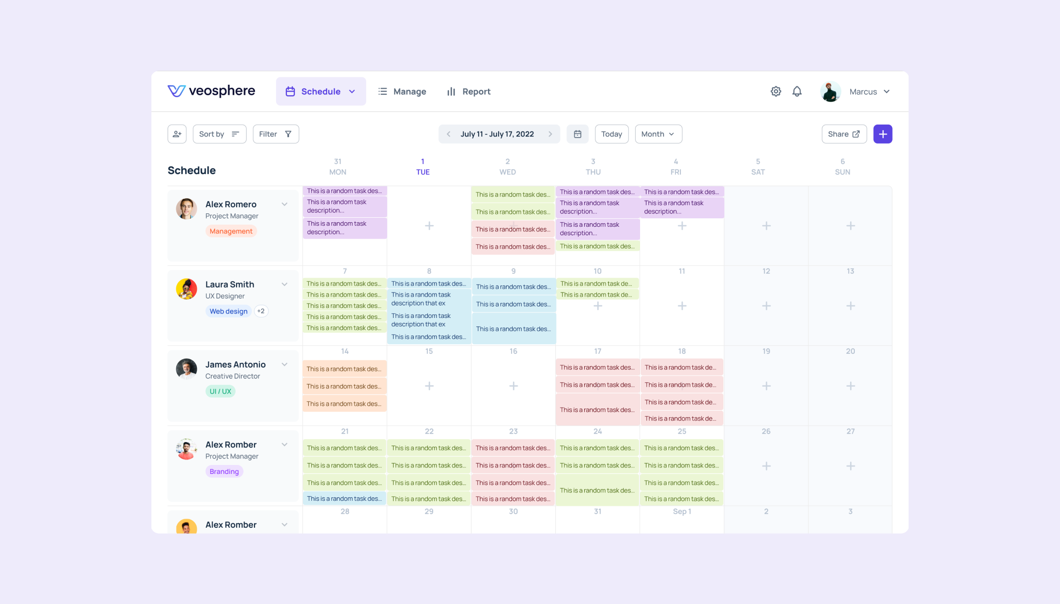
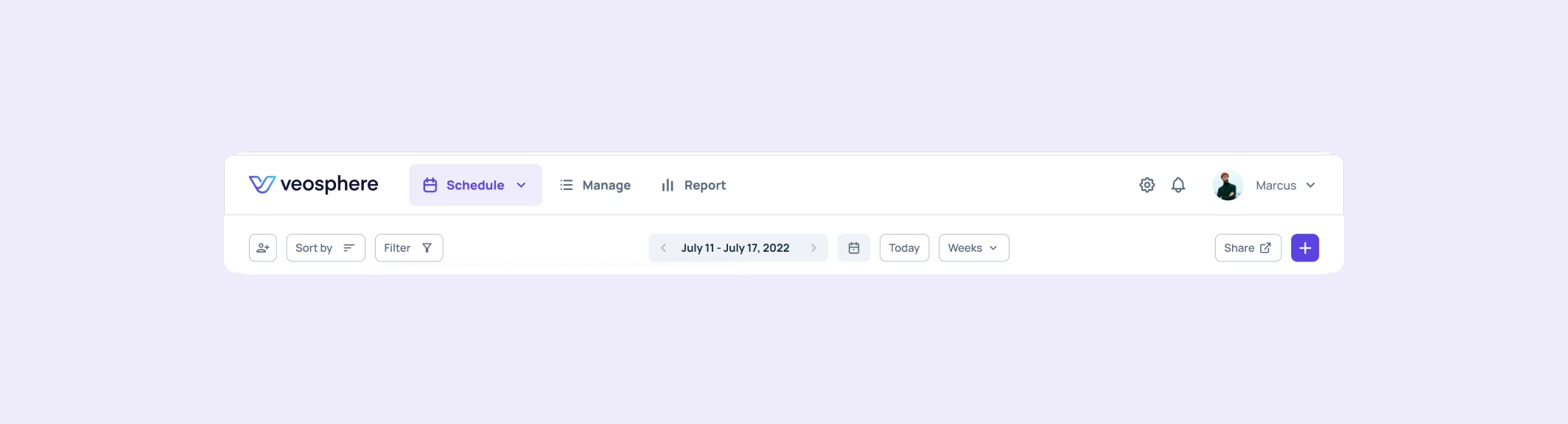
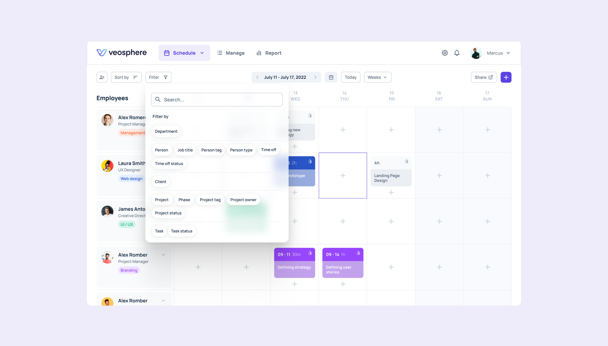
Schedule
The Schedule tab gives the user different options to plan projects, team capacity, and log the hours spent on each task or activity.
It's a simple yet effective schedule to provide an overview of the overall activities inside the team. Different views, custom colors, and a clean look make it very easy to handle.
And all that without sacrificing the more complex functionality.
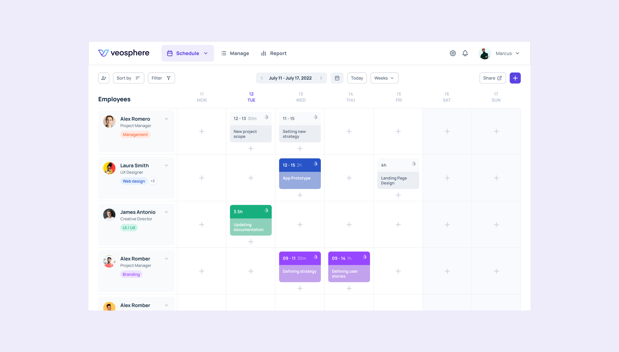
The overview schedule page gives insight into the overall capacity and schedule and enables in-depth task definition and project planning.
Teams can edit and reschedule their tasks in real time, with the option of weekly and monthly previews of what's ahead.
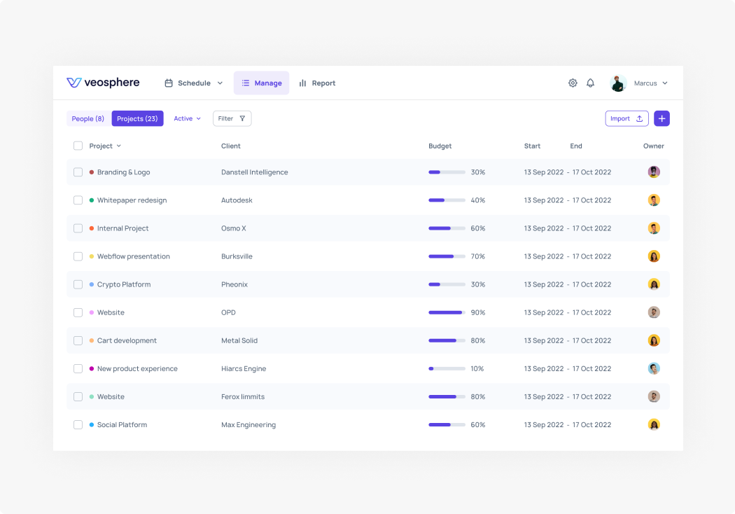
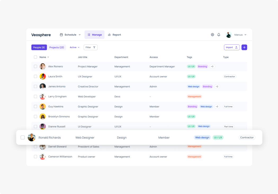
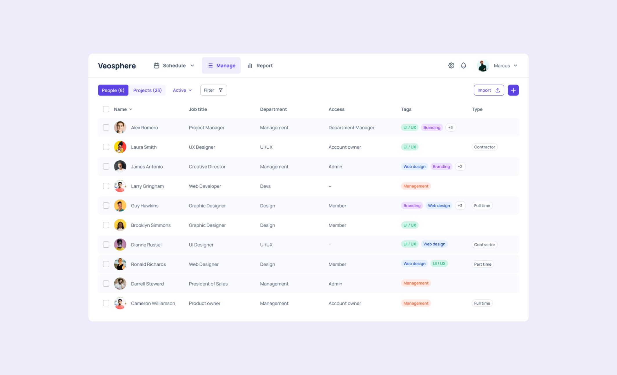
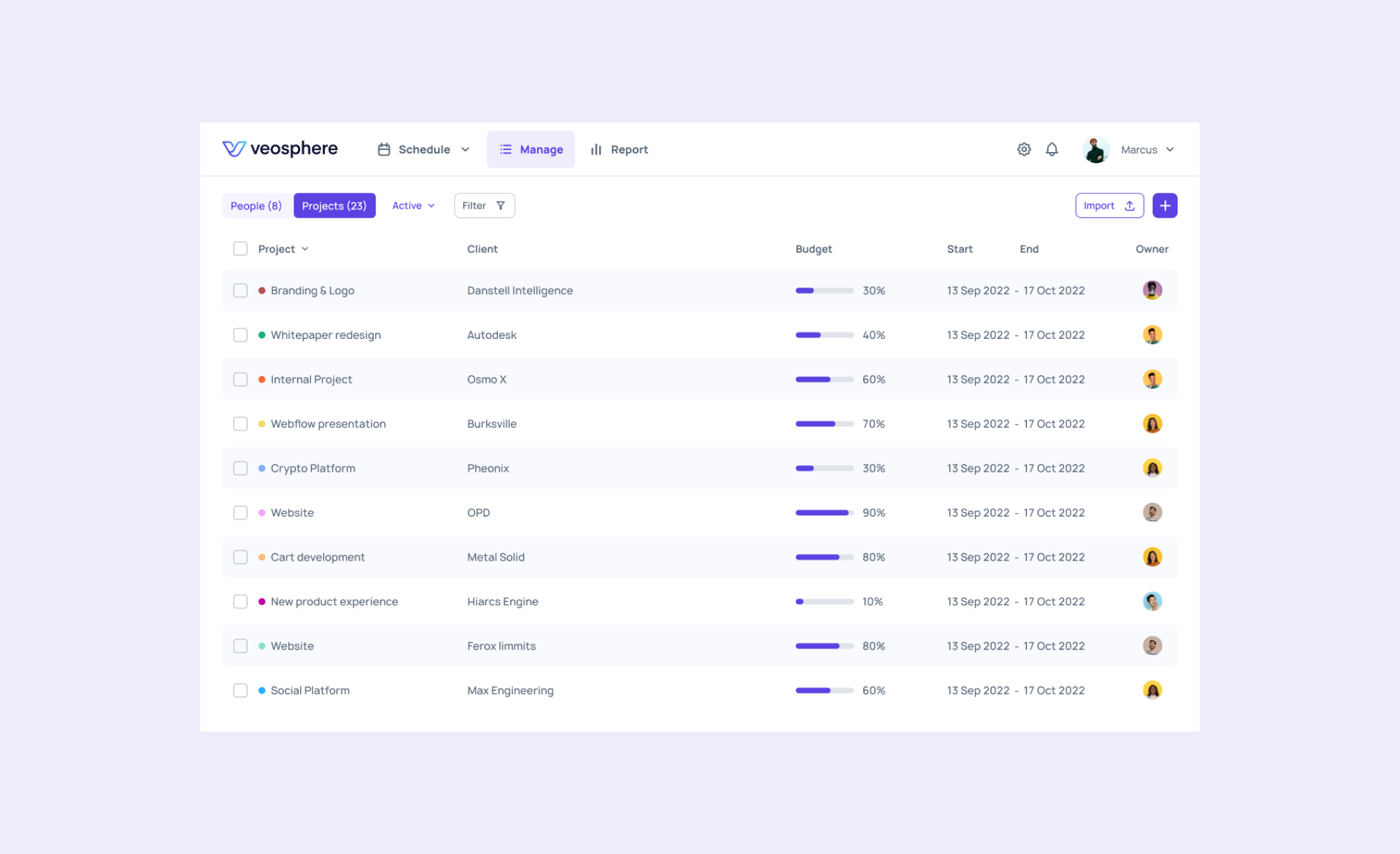
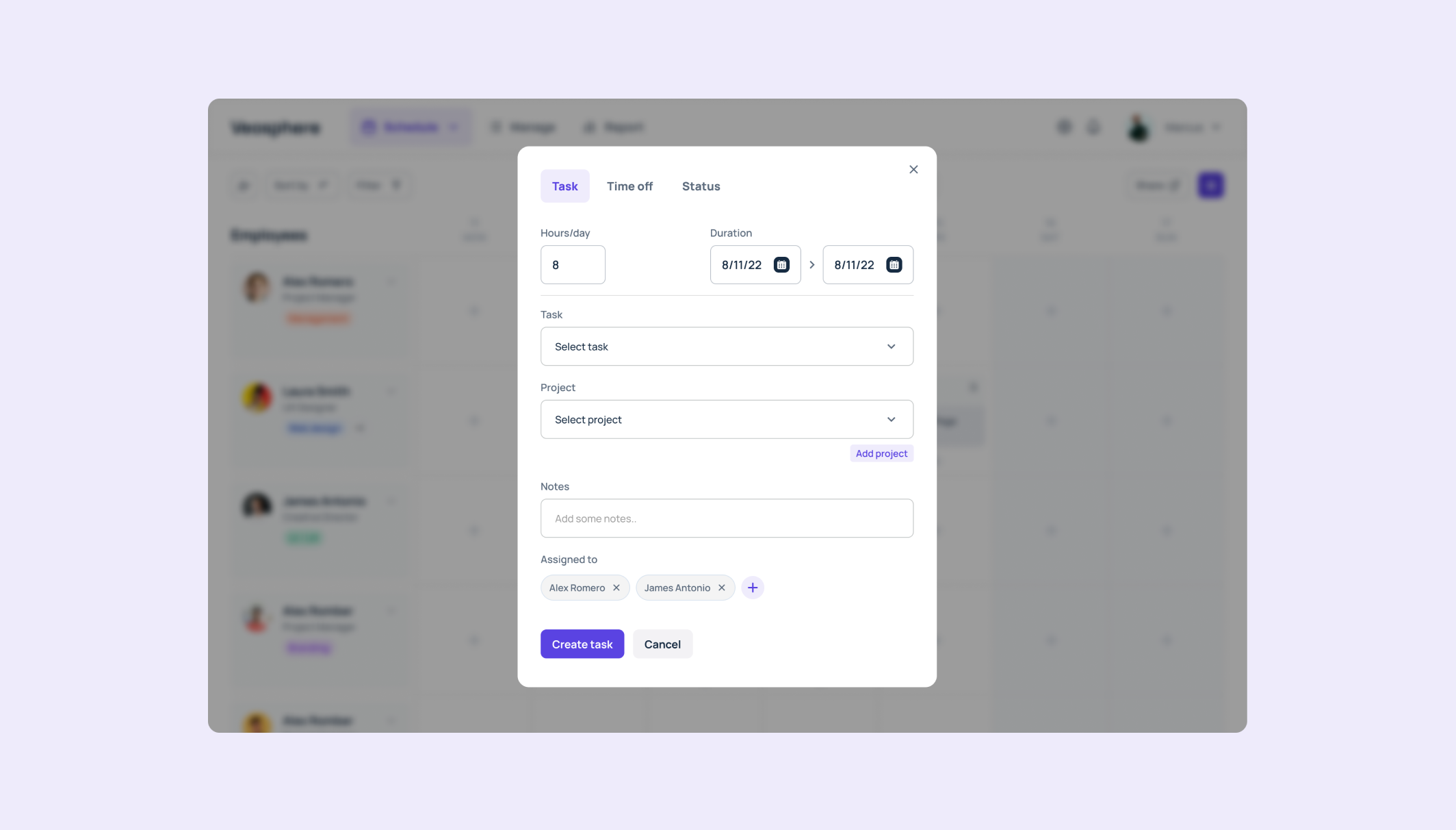
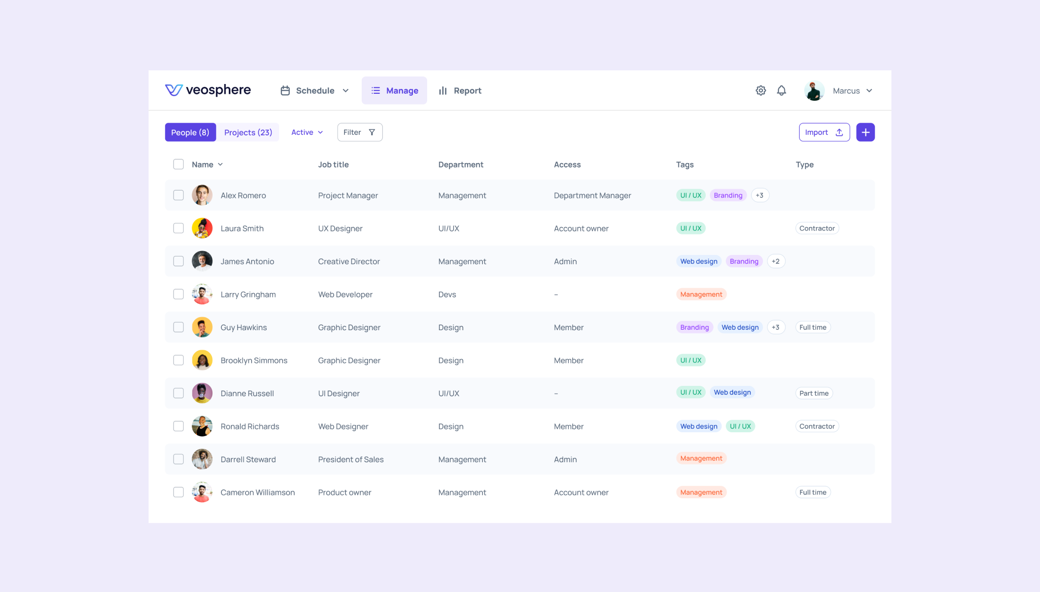
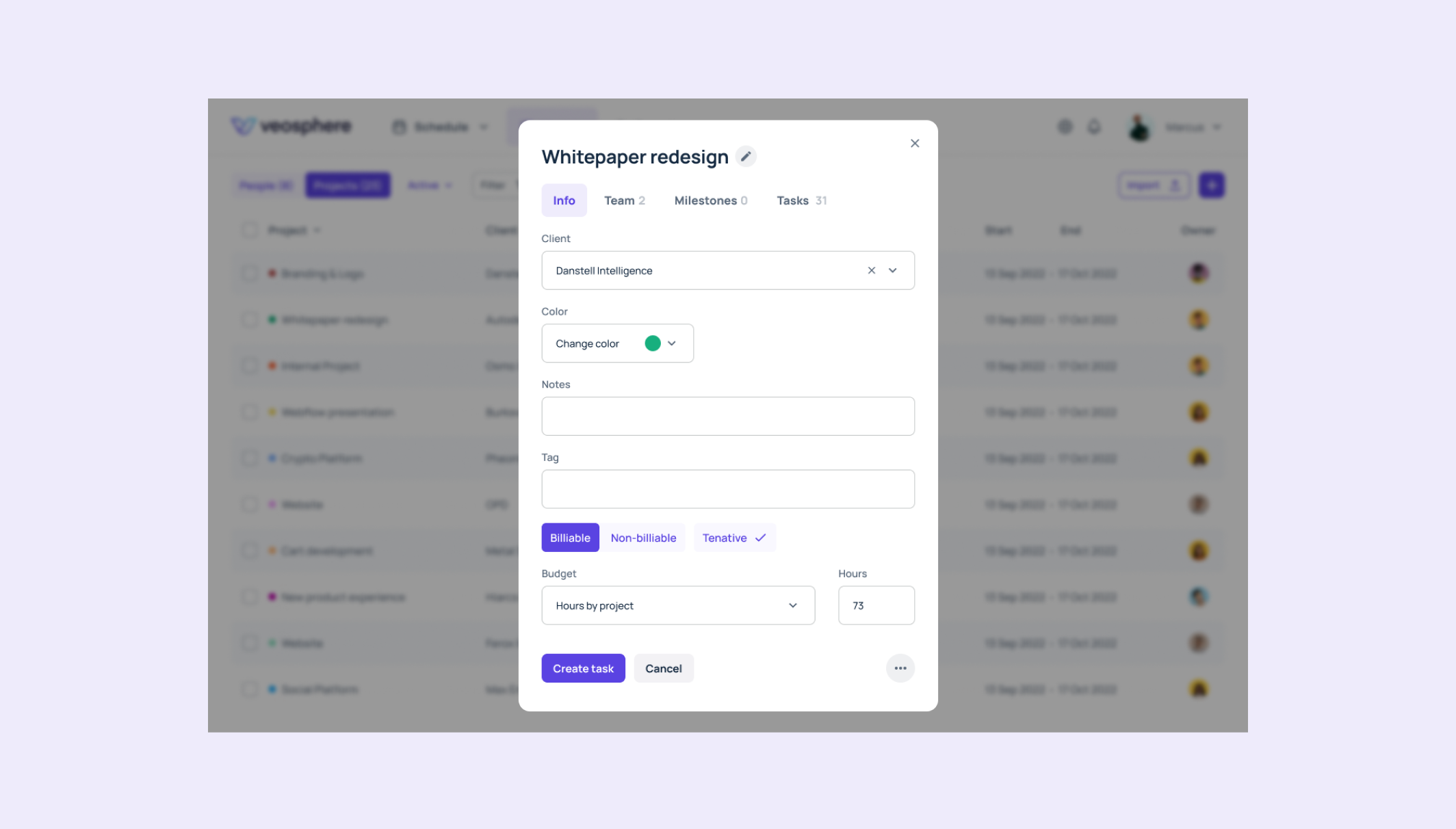
Manage
The Manage section enables – as the name suggests – managing resources and stakeholders. Users can set up clients, projects, employees, contractors, and freelancers.
Instead of cluttering this overview with the number of categories, we decided to go with the tag system. With them users can customize the categories for each item instead of having to choose from predefined ones.
Each project allows the user to set up the budget using different categories. Depending on the nature of the project, users can define the budget by hours or by currency.
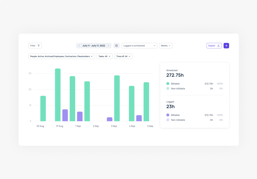
Report
Designing the report page turned out to be a bit more challenging. Clients, and the platform itself, demanded several levels of reporting. Individual and team hours, logged and scheduled hours, time spent on a project, budget spent on a client, etc. All those categories and their relations and comparisons had to fit inside one dashboard.
Again, instead of squeezing all that information into one dashboard, we created a plain and simple design. Users can choose the reporting criteria and generate reports which suit them best.
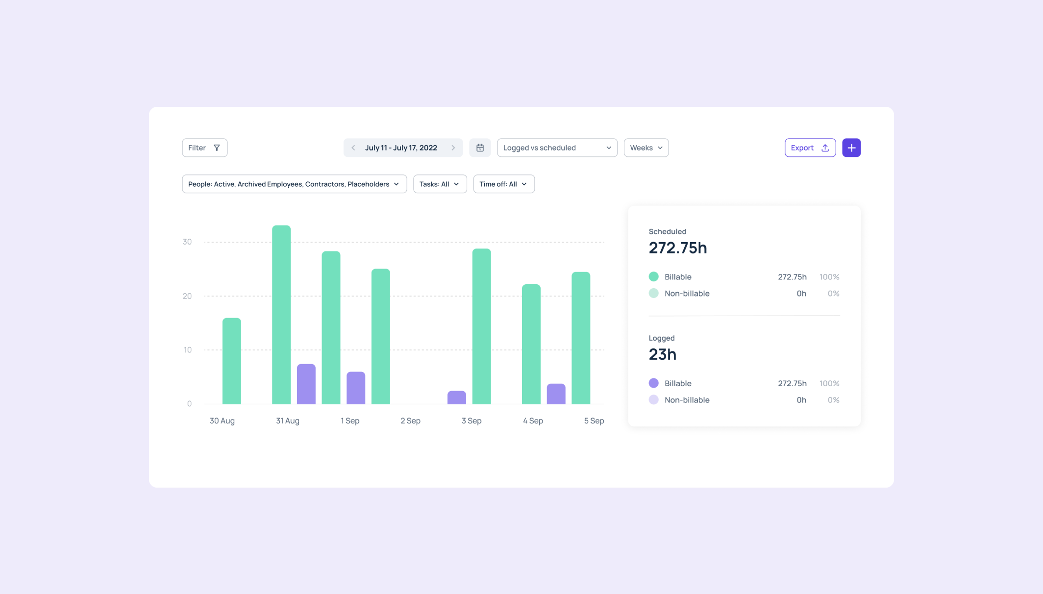
Users can customize their report dashboard on the go with just two or three clicks, without having to spend a lot of time defining the categories.
Easily accessible filters enable different overviews, depending on what we want the report dashboard to generate.
Website
Website design and development
Finally, we designed and developed a marketing website boasting a visually-appealing design.
Results
Outcome
During the entire design process, the words ‘minimalist’, ‘comprehensive’, and ‘functional’ were emphasized constantly. Tenscope aimed, and dare we say, succeeded in creating a platform which is intuitive and easy to use, but not lacking of all of the required functionality.
The result was a beautifully-designed system which makes project scheduling and team capacity planning effortless.
User engagement
+88%
Increase in average session duration, indicating improved
user engagement
Task completion
+20%
Increase in task completion rates, demonstrating enhanced usability and user satisfaction.
User retention
+37.5%
Improvement in user retention, indicating higher user loyalty and long-term engagement.
Feature adoption
+77.1%
Improvement in user retention, indicating higher user loyalty and long-term engagement.
From caterpillars to butterflies
One of the most common services sought from us by SaaS companies is a comprehensive redesign. In their early stages, startups often lack the time and resources to obsess over sophisticated interfaces. However, as these companies mature and establish a solid footing, they start to recognize that subpar design hinders their users from fully exploring and engaging with the app's functionality.
That’s where our designers come into play, helping companies to unleash the full potential of their products.

From start to finish, Tenscope gave us the advice, expertise and confidence we needed to pull off this critical project. The team was flexible and supported us throughout the process. What made our partnership with Tenscope so successful is the trust, dedication and collaboration of our joint project team.


Add designers to your team in hours, not weeks.
Discover the impact of world-class design with our 7-day free trial.
Get Started