Data Visualization 101: Choose the Right Charts and Graphs


Have you ever felt pressure from your team to present a lot of data by compiling it into a bubble chart or bar graph? Do you want to ensure you never feel the overwhelming pressure again? You're in luck! We've created "Data Visualization 101: How to Design Charts and Graphs" to help simplify creating data graphics for you.
In this comprehensive guide, we'll explore:
- Data exploration and explanation
- Different types of charts for data inventory and distribution for any type of data
- Which charts are perfect to compare different values
- Specific graphics to display changes in data
- How to choose a chart type for your data to make it easy to understand
- Best Design Practices for Different Data Sources
Key Takeaways
- Effective Data representation design combines chart selection, visual appeal & functionality for impactful insights.
- Color and typography can create a hierarchy and emphasize key points in data visuals.
- Funnel & waterfall charts are useful for tracking progress, flows & processes over time.
What is data visualization, and how does it aid in analysis?
Data visualization is transforming data into visual forms like charts and maps.
It is classified into two subsections, the first being data exploration and the next being explanation.
We do this to communicate information more effectively. Storytelling is powerful in marketing, and a chart shows a story visually. Choosing the best chart to convey a concept effectively depends on the data you have and the idea you need to convey.
What is exploratory Data analysis?
Exploratory Data Analysis (EDA) is a fundamental step in understanding data. It serves as the initial exploration of a dataset to understand its key characteristics and gain insights into its underlying patterns, anomalies, and trends.
EDA involves a series of techniques to represent information. These are designed to extract meaningful information from raw data without making assumptions or formal modeling.
EDA begins by summarizing basic statistics, such as mean, median, and standard deviation. These three data sets describe the central tendencies and dispersion within the data. Graphics like histograms, scatter plots, and box plots are then employed to reveal the distribution of data points and potential outliers.
EDA aims to uncover relationships between variables by generating correlation matrices and heat maps. These relationships help analysts identify patterns and dependencies. They use them to guide further analysis or modeling decisions.

What is data explanation?
Data explanation seeks to uncover the underlying reasons or causes behind the patterns, trends, and anomalies observed in a dataset.
Data explanation aims to answer the question, "Why is the data behaving this way?"
Knowing when to explore or explain is important as businesses receive continuous data from online forms, website analytics, and feedback. Knowing when to do this helps you choose the best chart to visualize data.
A preference shift towards data science
As the business world moves towards data science dependability, more businesses visualize data for decision-making. As such it is becoming one of the essential skills you need to grow. Exploring and analyzing data allows businesses to detect patterns, trends, and correlations within large datasets. Charts help show the relationship between two variables that might go unnoticed in text-heavy reports.
As these are useful for determining how variables relate to each other, they are sometimes called relationship charts.
These relationship charts can show more than positive or negative business progression. Charts make numerical data easier and data such as series of pages or steps in a customer journey on a website simpler. A good chart reveals trends or progress by making data easier to understand and follow. Meanwhile, failing to understand the type best used to display specific data makes the chart useless and result in a cluttered visual hierarchy.
Why do businesses invest time and money to train employees to display different data types?
Ultimately, envisioning data empowers us to make more informed business decisions. It encompasses the distribution of your data using visually appealing and engaging designs. In this blog, you'll learn to create visuals and the values within them. You'll understand how data are part of a whole picture of a business's health, and how you can thoughtfully and using transparency, share what you need to display.
A guide to chart types: How to Choose the Right Chart for Your Data
The chart used to show data is crucial to its success. However, businesses have many different categories of data at their disposal. Choosing the best type of chart for data distribution can seem overwhelming. So, let's outline the most common type of graph and chart for each data classification used to visualize.
Data Visualization 101: Best practices
You can display many data points without using businesses' most common charts. The most popular choice for businesses is a simple pie chart. Let's begin by learning about how and when this chart is used. Then, we will explain other types of charts you can choose and when you should use them. Then, because this guide to chart types is meant to be comprehensive, we will cover types of charts for the following use cases:
- What to use when you want to display discrete data
- How to present 4 data categories when you use area charts
- How to make sure labels are visible
So, let's get into it.
How to Design Charts and Graphs depends on your data sources
Pie and donut charts are excellent for visualizing percentages and proportions. They make it easy to read these values and avoid adding too much detail or using shapes that can confuse people.
A pie chart is one of the best charts to display data distribution across different services, clientele, or value sets. A pie chart will show the relationship between how a specific data collection performed compared to another. It does this by distributing the data into multiple sections by doing the following:
- Starting at a value like 0 (zero baseline if possible, but it isn't always)
- LIsting all possible values using thick lines, making it easy to label the lines directly above them.
When using a pie chart, it's easy to avoid clutter when one set of variables is input. But if there's a second data source, multiple pie charts are often used. If you have a third data set, use another chart, bringing your total to three. So, these charts are best for showing how data is distributed. Distribution charts help you understand where revenue and new customers may be hiding.
These are often used to avoid clutter because data sets require multiple graphics. You can make your chart pop by using varying colors or saturation. You want to avoid similar colors, or else people may not see the idea you're trying to convey.
But, if there are ten items to compare, creating 10 of these would be tedious and time-consuming. It also may not ensure data is easy to understand. If you want to plot more than 4 lines of data, it will be difficult to make sure labels are visible and easy to see.
Creating Clear Circlular Data Designs such as a pie chart
- Limit the number of categories.
- Use clear labels.
- Organize the categories.
- Provide a legend or key.
- Avoid overlapping labels.
Column and Bar Charts for Data make it easy to read data quickly
Stacked bar charts and column charts are ideal for comparing data across categories. These charts also help you understand the relationship between variables. Bar charts are also more helpful than donut charts when combining multiple data sources.
Stacked bar representations are particularly effective for this. The stacked bars allow you to plot data easily and show variations.
A visually appealing data graphic attracts attention, but clarity and accuracy are equally important.
First, employ basic balance, contrast, and mobile device compatibility principles. Next, use consistent colors. If you choose blue for data within a set, you can use lighter or darker shades for variations. The goal is to use one color for bar charts with variation. These colors provide information about how a collection of data relates.
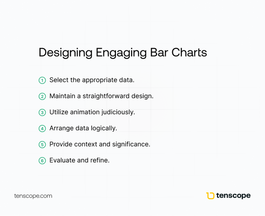
Designing Engaging Bar Charts
- Select the appropriate data
- Maintain a straightforward design
- Utilize animation judiciously
- Arrange data logically
- Provide context and significance
- Evaluate and refine
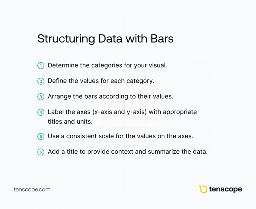
Structuring Data with Bars
- Determine the categories for your visual.
- Define the values for each category.
- Arrange the bars according to their values.
- Label the axes (x-axis and y-axis) with appropriate titles and units.
- Use a consistent scale for the values on the axes.
- Add a title to provide context and summarize the data.
Line and Area Charts for Trend Analysis
These visual charts are ideal for information about how a data source is trending. They allow for monitoring changes over time and illustrating part-to-whole relationships. You can quickly see the intermediate values of data that falls and rises. Although a line chart may seem boring, you can make it more interesting using an accent color to highlight a significant data point. Standard area charts can be used to accurately reflect the full value of a data set over time. The benefit is they can exist with continuous data sets.
You can quickly share a snapshot of whether a business is growing or not. However, ensuring line and area charts are simple to read can be challenging. It can cause clutter when one data label is long, let alone if you need to add multiple labels.
To best design these, line thickness is recommended from medium-sized to small. Don't use thick, clunky lines. Next, consider the size of the bubble where the value is represented. If the bubble, or dot, is too small or large, it can affect data comprehension.
Choose your colors wisely. At times, you may need to print these. The image could become difficult to read when printed in grayscale.
Complex Data Relationships with Scatter Plots
Scatter plots are best used to show variations within one subset of data. They help detect patterns and identify correlations.
Best design practices for scatter plots entail using multiple shapes, colors, or sizes. Since various data types are represented and will sometimes overlap, shapes and colors will improve readability.
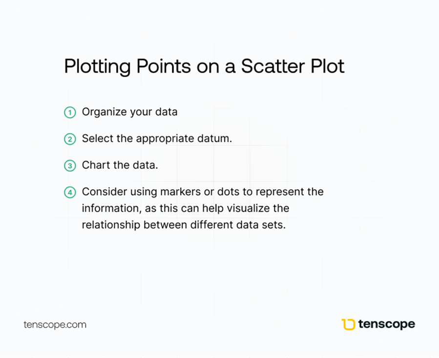
Plotting Points on a Scatter Plot
- Organize your data.
- Select the appropriate datum.
- Chart the data.
- Consider using markers or dots to represent the information, as this can help visualize the relationship between different data sets.
Gantt Charts are the best type of chart to use for progression.
Many people confuse a Gantt chart with a bullet chart. A bullet graph reveals progress, right? Not exactly. It would help if you chose a Gantt chart for progression. Doing so will help you find bottlenecks that prevent efficiency so you can prevent them in the future. Use contrasting colors for the background and the bars you add to the chart to make it easier to read.
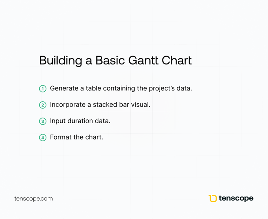
Building a Basic Gantt Chart
- Generate a table containing the project's data.
- Incorporate a stacked bar visual
- Input duration data
- Format the chart
Visualizing Flow and Process with Funnel and Waterfall Charts
Funnel and waterfall charts effectively monitor completion rates and illustrate value changes. Funnel charts display progression through stages, while waterfall charts reveal the composition and changes in data values over time.
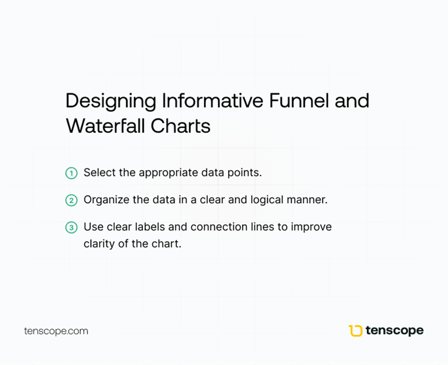
Designing Informative Funnel and Waterfall Charts
- Select the appropriate data points
- Organize the data in a clear and logical manner
- Use clear labels and connection lines to improve the clarity of the chart
Dual Axis Charts to Find Trends Quickly
Dual-axis charts blend two distinct visuals into a single graphical representation.
Using this chart type, you can plot data using two y-axis and a shared x-axis. Therefore, you can quickly find a trend between these three data variables.
Knowledge Graphs for Connected Data
These are robust data frameworks that depict information through interconnected nodes and edges. Nodes represent entities like individuals, locations, or ideas.
Edges symbolize the connections between these entities.
These visuals specialize in capturing intricate, multidimensional data and their interrelations. As such, they are valued by many businesses.
Understanding the Role of Color and Typography for Data Visualization
Color and typography are important, and they enhance data readability and impact.
Use elements such as color, line thickness, and labels strategically. They will enhance or reduce the readability of your data representations. Even something as simple as font can drastically impact your data representations.
Here are some additional guidelines to assist you in creating stunning yet effective data representations:
- Streamline the design
- Use appropriate chart types
- Apply color strategically
- Provide clear titles and labels
- Experiment with various formats
Did you learn how to choose a chart type to compare values?
Understanding and presenting data effectively takes time, but following this guide can immediately improve your abilities. Practice and follow the techniques mentioned here to become a master decision-maker today.
Frequently Asked Questions
How do you create a data visualization chart?
Start with your research question, acquire and clean the data, choose an appropriate chart, select a tool, and refine the graphic according to best practices.
What are the steps in the data graphics design process?
Understand your audience, choose the right chart, select a software program, declutter, clarify your message with color and text, test your draft, and share the completed data representation.
What is the rule of thumb for designing data graphics?
Select the right type of visual representation for your data and message: bars for categorical data, line charts for trends over time, and scatterplots for comparing two numerical variables.
How do you design a chart?
Determine the best chart type, start with a template, gather your data, plug it into it, design it, and share it.
What factors should I consider when selecting a chart type for my data?
Consider the relationship between variables, the purpose of the design, the data itself, and your objectives.