Top 10 Fonts for Social Media That Will Grab Your Audience's Attention

Picking the right font for your design is a science.
Remember the good old days where Times New Roman was your standard go-to for everything formal and Bradley Hand was your closest option to digital calligraphy?
Today, there are Latin calligraphy brush scripts that are so exquisite, you can churn out handwritten letters in the most beautiful penmanship with almost zero effort.
It is truly a testament to how far we have evolved in this digital age, as an estimated HALF A MILLION fonts now exist online today. That’s right. Half. A. Million.
While we love having so many options, it can also be really confusing to choose when there’s just so much variety. It’s like walking into a restaurant and being handed a thick, 30- page menu with hundreds of items to choose from. Overwhelming is an understatement. Helvetica is great but what if it’s too mainstream? Too bold or not too bold, that is the question.
Luckily for you, we’ve compiled a list of our favorite sure-win fonts for social media. Read on and you can’t go wrong!
Firstly, before we delve in… what are the different types of fonts?
The 5 different types of fonts are:
1. Serif
2. Sans Serif
3. Slab Serif
4. Script
5. Decorative
Serif
Serif fonts scream traditional. This type of font has small strokes or lines added to the ends of the letters. Serif fonts are popular choices for brands that want to be seen as well established, classic and timeless. They are especially loved by brands associated with fashion e.g. Prada, Burberry and Armani.

Sans Serif
Sans serif fonts are arguably, the most popular and readable. There are no strokes added at all and this makes it the best font to use when reading from screens. For this reason, sans
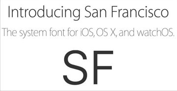
serif fonts are especially popular with brands associated with technology. Apple and Samsung have always stuck to sans serif for their operating systems. In 2015, Apple even went the extra mile to customize a bespoke font – San Francisco to maximize legibility on the Apple Watch amongst its other products.
With its crisp, sharp lines, using sans-serif fonts help you convey a contemporary vibe. Sans serif fonts are an especially good fit for brands that want to be seen as modern, casual and approachable.

Slab Serif
The fatter cousin of Serif, Slab Serif fonts are chunkier in body, but share the same distinctive lines and strokes extending from the ends. Slab serif fonts catch your attention immediately and so, they are great choices for brands that want to make a bold statement.

Script
Script fonts are linked, cursive and resemble handwriting. Due to its many loops and curls, they are less commonly seen in logos and branding as it’s not the most legible. Having said that, they are great for headings, accent phrases, and to add a touch of femininity to brands
associated to wellness and beauty. They are also popular with brands that want to communicate creativity or even, a sense of ‘whimsy’.

Decorative
Similar to script fonts, decorative fonts are also more limited in range. Having said that, they are great at giving a fun, laid-back vibe and brands that manage to pull off using a decorative font as their logo, are usually the ones that leave the biggest impression.

Now that you know the differences between your fonts, let's delve into our favorites!
1. Montserrat
Inspired by the signage and typography seen in the neighbourhoods of Buenos Aires, Montserrat is a geometric sans-serif typeface loved by many web and UI designers. The simplicity of its letters makes it one of the most readable fonts and yet, it has a lot more character than Arial or Helvetica. This makes it a classic, timeless option that evokes modernity.

2. Roboto
Developed by Google as the system font for its mobile operating system Android,
Roboto is used in many social media apps such as Instagram and Gmail’s inbox app. With its largely geometric form, open curves and natural width between letters, Roboto encourages a natural reading rhythm. Overall, Roboto is a great fit for most contemporary brands that want to look sleek and polished.

3. Playfair Display
With its well-rounded corners and beautiful curves, Playfair Display is a wonderful choice for a serif font as it looks modern and not overly-traditional, like how some serif fonts can be. One of the biggest advantages of Playfair Display is how the regular style looks clean and modern, but the italic version is fancy and decorative. This makes it a versatile font to use when designing graphics for social media. We especially love using Playfair Display for fashion and editorial related designs!

4. Poppins
We love using Poppins as a font for both headings and body text as it’s a font that just can’t go wrong! The shape of the letter form is almost equal in height and the spacing between letters is perfectly designed, making it an aesthetically pleasing font to use. One extra advantage of using Poppins is how it has many weights. From thin to light to medium to bold, it’s got all your design bases covered. This means you can get everything done using just one font and you end up with a really clean looking design! Now that’s what we call a win-win.

5. Lobster
While we love sans serif fonts for how easy they are to read, once in a while you still need to jazz it up! Even though Lobster has become slightly overused since it exploded in popularity, we still love it for its retro feel (old-school American diner vibes, anyone?). We find it absolutely perfect for designs related to food, drinks or anything vintage!

6. Daydream
Of all the calligraphy fonts out there, Daydream is one of our favorite choices as it’s both fresh and modern, with an elegant baseline. It’s perfect combination of brush lettering and traditional handwriting makes it an amazing choice for cards, posters and personal branding, not to mention anything wedding-related.

7. Ramaraja
This serif font is visually appealing to look at and can be used for everything from logos to headings. Besides grabbing your attention, Ramaraja also pairs well with Roboto and Raleway. We love using Ramaraja for anything related to literature, books and publications.

8. Raleway
Raleway is a beautiful, elegant sans-serif font that is easy on the eyes. It looks especially incredible as a display font and it has always been highly popular for large headings. If you are already using Montserrat in your design, Raleway also complements it perfectly. Despite both of them having strong personalities, they don’t overpower each other and instead, help the other shine through in a perfectly balanced manner.

9. Oswald
Inspired by the classic gothic and grotesque styles of the late 19th and 20th centuries, Oswald is a condensed sans serif font. It’s classic look pairs really well with Roboto and it’s a versatile font that looks nice for both headers and content. We especially like using Oswald for websites as it looks professional, yet oozes charm and character.

10. Pacifico
Inspired by 1950s surf culture, Pacifico practically oozes chill-out, beachy vibes. This fun script font is highly popular for brands that want to convey a relaxed feel. Like Lobster, it has a subtle retro flavour to it and we love it as you hardly find thick scripts like Pacifico, with beautiful curves and so much character.

So, what do you think of our top 10 fonts for social media? Do you already have a font in mind for your brand’s social media channels? Don’t be afraid to try a few combinations as different fonts can change the feel of your message entirely. Remember: your choice of font can make a huge impact on how the message is delivered. However, if you need some guidance do not hesitate to contact us, we are happy to help!


