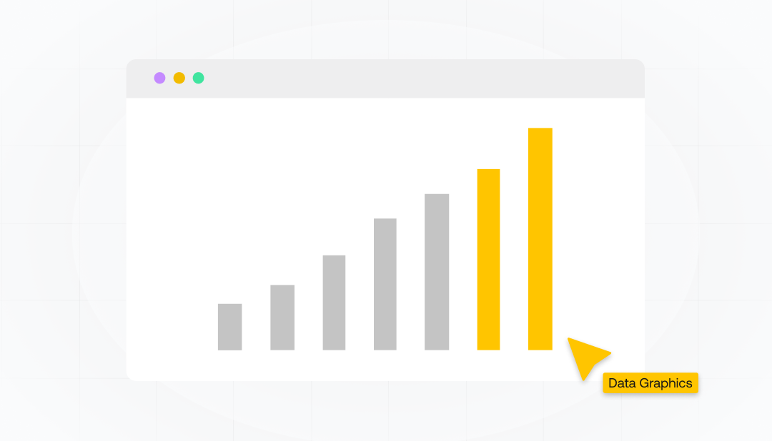
10 Essential Data Visualization Design Principles for Clearer Insights


Data visualization changed the way we understand and interpret data. Visuals help us understand a large volume of data simply when similar types of information need to be analyzed. They can highlight important data like a website's interactivity and the number of visitors.
But what makes good data graphics? What are the aesthetic aspects of visualizing data with ease? Most importantly, how can we harness their power to aid in understanding data?
Keep reading to understand the essentials of using graphic visuals to easily present a large amount of data.
We will share the principles for creating beautiful graphics and tell a story through data. You will learn the design and aesthetic aspects that maintain the user's attention and are easy to understand.
Key Takeaways
- The purpose of data visualization is to convey complex information
- Using graphical representations, any type of data is easier to understand
- Helping people understand data revolves around simplicity
- You should use color strategically
- Highlighting crucial information after data extraction involves employing design principles
- Minimizing clutter helps to communicate different data insights effectively.
- When it comes to the design, ethical considerations ensure the trustworthiness of visualizations
- The point of data graphics is to avoid misrepresentation and bias
- When it comes to representing data graphically, the aim is to promote transparency & accountability
The Essential Role of Data Visualization in Analytics and Machine Learning

A deep understanding of data sets is important for effectively communicating big data points. Failing to provide visuals for raw data can hinder your audience's comprehension. When people see a lot of data, their brains shut off. Visualizing your data can keep them focused and reading to learn about your main point.
Your business depends on conveying information effectively to customers and other business owners. If you cannot do so, your business will not grow. So, how can you create stunning graphical representations people want to read?
The following principles will give you a framework for successful data graphics.
You should aim to produce graphics that have:
- Simplicity
- Clarity
- Visual appeal
When you incorporate all three elements together, you'll produce helpful graphics. Data visuals are also important for accessibility. Design elements can hinder or boost comprehension.
Can you understand why creating effective visuals is more than compiling data into Canva? If not, let's explain it in the simplest terms using concrete examples.
How Effective Data Visuals Influence Decision-Making
We represent data in graphics to show data effectively in an understandable, accessible, and visually pleasing way. Every visual you produce has the potential to influence. Simultaneously, they can cause people to ignore your business.
When displaying similar information types, your graphics must be easy to consume. Simplicity ensures viewers can quickly gain meaningful insights and analyze information.
Considering the audience when crafting data representations guarantees they will be easy to understand.
For example, a top business stakeholder will understand more detailed data graphics, such as return on ad spend (ROAS) and cash flow charts. Meanwhile, the average person might feel overwhelmed if they must understand such data.
Give viewers the information you want them to concentrate on so they can make crucial decisions without overwhelming them. As with everything, you must first understand your audience to complete the design process.
Data Visualization Principles for Diverse Audiences
Tailoring data visualizations to different audiences' needs and comprehension levels is essential for ensuring their continued relevance and effectiveness. Identifying the target user persona is critical to creating efficient graphics that meet the user's needs and objectives. The skill set is particularly important for many data scientists who use visualizations.
Customizing data graphics to suit the needs and comprehension levels of diverse audiences allows the same visual to be understood by different viewers. This ensures clear and effective communication of information.
Design Principles for Effective Data Visualization

You need to follow key principles for impactful data graphics:
- Emphasize simplicity
- Select the appropriate chart type
- Use color strategically
- Highlight crucial information
- Reduce clutter and noise
Employing these essentials guarantees your visual data representations will be successful.
Let's outline each of these principles so you understand them better.
Emphasizing Simplicity
Simplicity is fundamental when it comes to data visualization design.
To achieve this you can:
- Avoid complicating complex data
- Focus on highlighting noteworthy trends and correlations
- Organize similar data into categories or clusters
- Select the most appropriate chart for the data and its purpose
Most readers don't have an eye for digging up information that's not easily found or understood. Include visual elements like various colors, lines, and points. It's one of the simplest methods for guaranteeing people can quickly discern data.
Choosing the Right Chart Type for Clear Data Presentation
You can't select any chart for a data set. Selecting the right chart type based on the purpose, audience, problem, and data type is important.
There are various chart types to choose from when creating data graphics. They include:
- Scatter plots
- Line graphs
- Pie charts
- Bar charts
- Heat maps
- Area charts
- Choropleth maps
- Histograms
You can't choose an appropriate chart if you don't understand your data. For instance, bar charts, pie charts, histograms, and box plots are most suitable for representing categorical data. Meanwhile, line charts, scatter plots, and area charts are ideal for continuous data.
The Strategic Use of Color
Color is a powerful visual element in data graphic design. Colors direct the viewer's attention and aid in understanding.
Using complementary colors, hue, and intensity affects how readers perceive your data.
Carefully consider how you're using color to highlight specific data points or categories. Design is said to be successful when it creates an appropriate response. Colors can make visuals pop and get attention, but using them incorrectly can cause the opposite effect.
Highlighting Important Information with Data Analysis Techniques
Highlighting the most relevant information helps people understand your graphics quickly. You can achieve this by:
- Using color to emphasize specific data points or categories
- Adding annotations or labels
- Leveraging visual cues
- Incorporating interactive elements
Make sure you use visual cues to create graphics that move people from more important to less important information like:
- Size
- Contrast
- Position
- Color
Emphasize important information and make it stand out using visual elements. Doing so means people can quickly locate the information most important to them and understand what you're conveying without much thought.
Minimizing Clutter and Noise
You want people to read and think about the data graphics you produce. Unless you minimize clutter, they will not.
Using negative space reduces clutter and noise. Avoid highlighting unnecessary visual components or information that would otherwise distract or confuse the viewer. If you do, your graphical data becomes useless, as its main objective is to get people thinking.
Here are some tips to reduce clutter in your data graphic:
- Eliminate chartjunk
- Remove extraneous metadata
- Avoid 3D charts
- Create visual order
- Assess the visualization
Modern data visualization must be clutter-free. We live in a world where people are bombarded with information, and unless you can get to the point, people will ignore you and your business.
Advanced Techniques in Exploratory Data Analysis for Complex Data
Beyond basic design principles, there are sophisticated techniques for visualizing complex data you can use to improve understanding and engagement. These advanced techniques include small multiples, interactive visualizations, and data transformation and aggregation.
A small multiple is a series of data representations compared on one graph. Interactive visualizations include buttons, effects, and other visually appealing stimuli. Data transformation and aggregation is a method of moving data around in presentations to clarify a point.
These techniques help people understand complex data easily. They allow readers to uncover a hidden pattern by using similar movements in a presentation or colors on a graph.
Small Multiples: A Popular Visualization Technique in Data Science
Small multiples refer to creating multiple small charts that share the same axes and scales. They share a commonality but display different subsets or categories of data within that commonality. These allow for effective data presentation and easy comparison across variables.
The small multiples technique is particularly useful when dealing with detailed, multi-dimensional data. Data that would be too intricate to display in a single chart.
Small multiples enable easy comparison and analysis of multiple data dimensions. Using them, you can demonstrate comprehensive, multi-dimensional data across the plot without overwhelming the viewer and present data effectively.
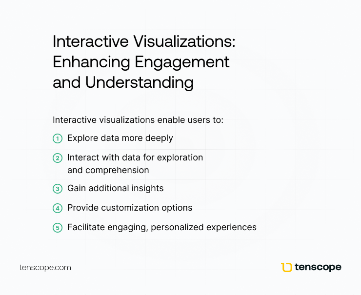
Interactive Visualizations: Enhancing Engagement and Understanding
Interactive visualizations enable users to:
- Explore data more deeply
- Interact with data for exploration and comprehension
- Gain additional insights
- Provide customization options
- Facilitate engaging, personalized experiences
The main goal of interactive visualization is to keep people on task while they explore your data.
Examples of effective interactive visualizations include:
- Pine Cove Camp
- Tualatin River Watershed Navigator
- The Pudding: Wine
- Fantasy Football NFL Analytics
- The New York Times' Coronavirus Tracking Map
You should incorporate interactive elements often. Many people find data analytics overwhelming and boring, but interactive elements squash boredom.
Data Transformation and Extraction
Transforming and aggregating data allows you to highlight relevant data easily.
Data transformation involves converting, cleaning, and structuring data into a usable format to create a stunning graphical representation.
You consolidate multiple data points into a single value or statistical summary when aggregating data. Therefore, data complexity is reduced by presenting it in bite-size, digestible tidbits.
By transforming and aggregating data, it's easier for people to identify patterns, trends, and insights.
People like simplicity, so it's a surefire way to keep them focused.
Tailoring Data Visualization Tools for Different Contexts
No data sets are the same when collecting, reading, or interpreting them.
So, your data graphics must be adapted for different contexts to ensure relevance and effectiveness across various industries.
Let's see how vital it is to tailor data graphics for various contexts, such as business and education. We'll discuss elements to consider when customizing visual data representation.
The Impact of Data Graphics in Business Analytics
Visualizing data plays a significant role in business. From providing high-level insights and tracking performance to decision-making, you can't escape data.
You need to transform data into a medium customers and employees will love. Usually, we see data as:
- charts
- graphs
- maps
- dashboards
These data representations provide businesses with a comprehensive understanding of their performance and support data-driven decisions.
Data graphics tools can further assist your business in tracking its performance by:
- Monitoring relevant metrics
- Detecting trends
- Comparing results
- Conveying insights to teams and customers
But you must get into a rhythm for a data graphic to appropriately convey all the above. The rhythm is when the design elements all work in harmony, and the information just clicks in the minds of the viewer. So how can you do that? Is it all about the visualizations, or is some of it education?
Educating Everyone on Data Literacy and Visualization Principles
Data literacy and visualization education can't be understated in today's data-driven world.
The demand for skilled data visualization experts grows daily. So, we need everyone to have the required skills to interpret data.
What does this look like descriptively rather than on a prescriptive scale?
We need to incorporate data in various formats starting in elementary school and keep with it through university.
Data literacy and visualization education prepare future professionals to navigate our data-driven world. Many data scientists lag far behind where they should be in comprehension and skills. It's sad, but we can fix it with early intervention.
Ethical Design Principles for Stunning Data Visuals
Why are ethics important when visualizing data?
They're important for maintaining trust and integrity in data analysis. At times, we insert bias into our data graphics without being aware. We should always strive to create unbiased data graphics that convert facts, not feelings.
It's important to talk about ethical considerations in data visualization design. We will explore strategies to avoid misrepresentation and bias so you can promote transparency and accountability.
Avoiding Misrepresentation and Bias in Graphs and Charts
Misrepresentation and bias in data graphics can lead to incorrect interpretations and conclusions. These cause detrimental effects on decision-making and actions.
However, carefully considering design choices ensures data visuals are accurate, unbiased, and transparent. Designers can uphold ethical standards to contribute to integrity and credibility for data-driven insights.
To avoid misrepresentation and bias, represent data using graphics wisely. Utilize text judiciously and leverage interactive tools and technologies.
Promoting Transparency and Accountability in Visualization Libraries
Transparency and accountability in data representations build trust and credibility among users and stakeholders. Being transparent about data sources, aggregation methods, and assumptions establishes trust. These promote accountability for quality and implications of data.
Some recommended practices for transparency and accountability include:
- Considering the best way to represent data
- Thinking about the audience that will receive the data
- Following ethical practices
- Incorporating transparency and accountability tools
Designing data visualizations doesn't need to be difficult. Think about how you present information and how people will receive it. It's a key pillar of a successful business.
Summary of How To Use The Right Data Visualization
Data visualization is a powerful tool for understanding and communicating complex information.
When you:
- Follow key design principles
- Employ advanced visualizing techniques
- Contextually adapt your designs
- Consider ethical implications
You can create compelling graphics and effectively convey insights to inform decision-making.
As data continues to play an increasingly important role in our lives, mastering the art of data visualization becomes more essential.
Frequently Asked Questions About the Principles of Data Visualization
What are the principles of data graphics design?
Seek balance among visual elements. Use patterns to identify information and proportions to represent values. Be sure to verify data accuracy before using it.
What are the six basic principles of design in data visualization?
The six design principles for data visualization are balance, pattern, rhythm, emphasis, contrast, and unity. With these principles, you can create effective visuals with impact and clarity.
What are the 5 Cs of data visualization?
The 5 Cs of data visualization are clean, consistent, conformed, current, and comprehensive. You can't neglect any of these to ensure effective data processing.
What are the four pillars of data visualization?
The four pillars of data visualization are distribution, relationship, comparison, and composition. These fundamental concepts lead to meaningful visualizations from data sources.
How can data visualization help in decision-making?
Data visualization makes gaining insights from data easier. It helps decision-makers understand facts quickly to make informed decisions.